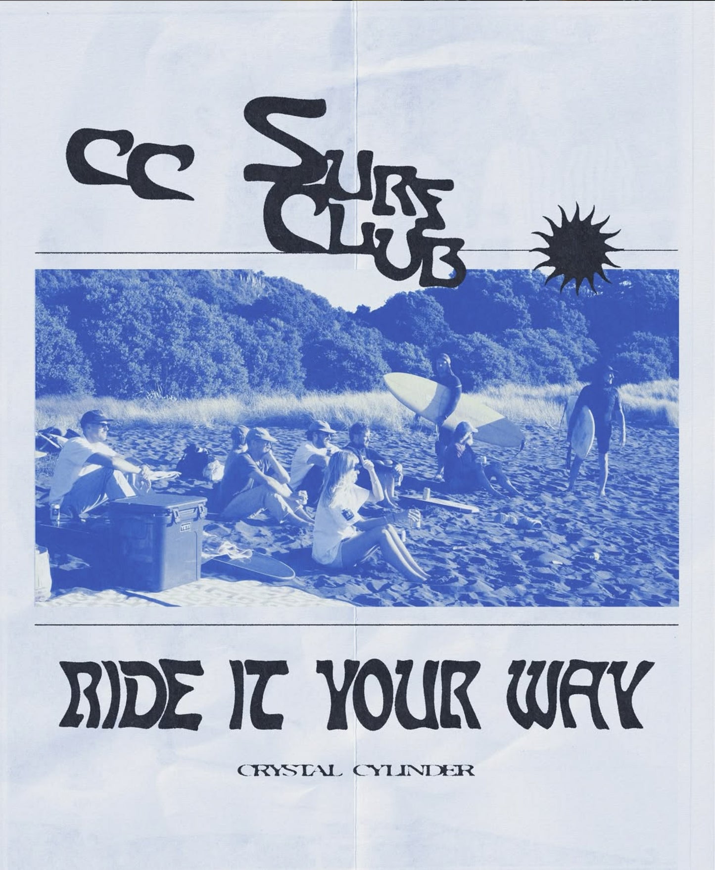
Arthur's newest collection embodies all things friendship + interconnection, so it's only fitting their playlist titled “Arthur Worldwide” includes a vast collection of tunes from around the globe. There’s something to tickle everyone’s fancy (in almost any language).
We asked Olivia, to put together some words on the Arthur brand her muses, methods and how this collection came together.
-
Words: Olivia of Arthur Apparel
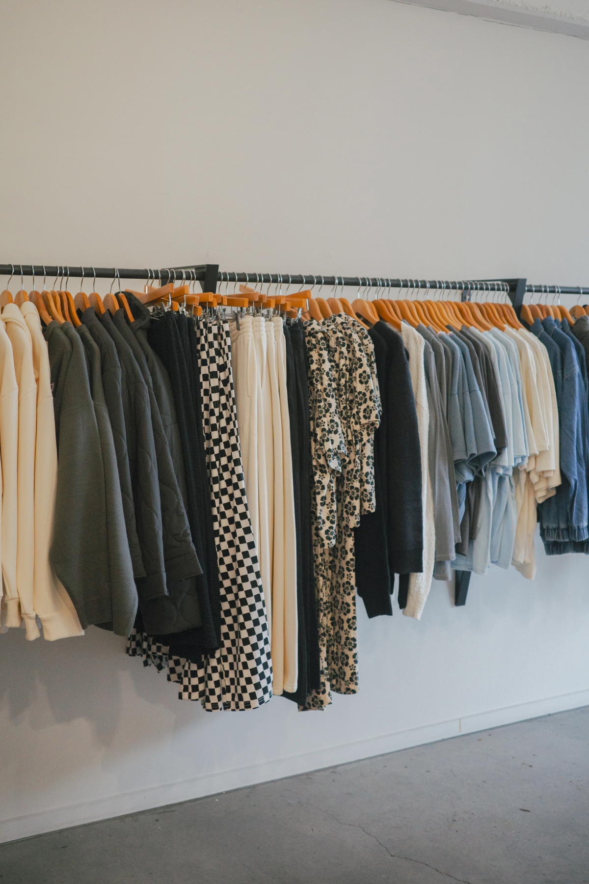
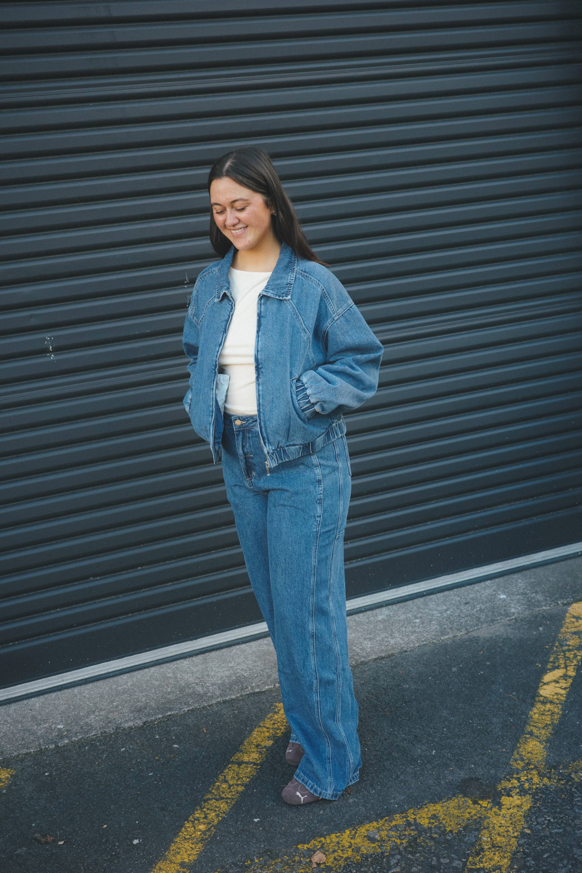
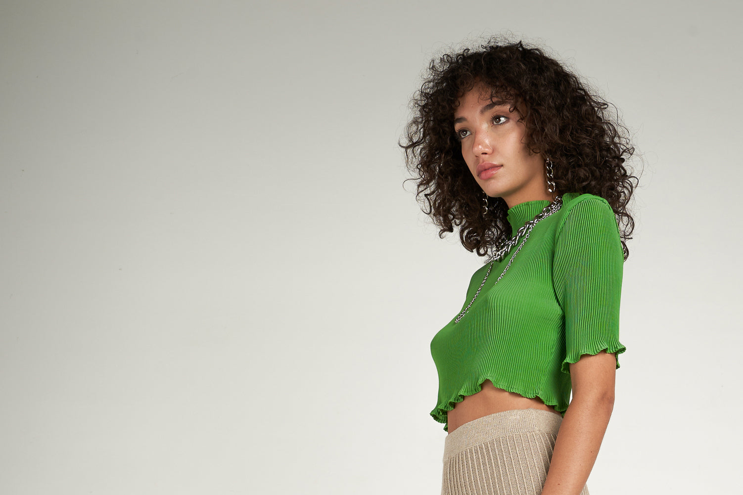
Since a young age, I always admired minimalist design. I’m attracted to clean lines and uncomplicated construction, it’s just my personal preference, possibly attributed to my father. I’m attracted to high contrast, particularly in colour. That’s why our prints and colour combinations are always bold and somewhat uncomplicated. In my opinion, a garment has more impact and is more memorable this way. This love for contrasting colours and minimalism is not only in our designs but actually makes up the entirety of the brand identity itself; our imagery, graphics, tone of voice. You can see in our campaigns, I always use high flash to create defined lines in the garments, on the model, in her shadow.

The brand feels fresh and contemporary due to our very careful balance of juxtaposition. I’m always ensuring that there is an even balance of elements in our visuals for example our styling where the most prominent juxtaposition are the masculine and feminine energies. For example, a pink dress is balanced by a pair of “men’s” sandals, or a pair of sweats by stilettos. This juxtaposition is used right down to my creative development process and helps us to maintain the androgynous tone of the brand.
-
Arthur was the name of my late father. I guess I hold him in highest regard as someone who taught me many of life's lessons. He was a doctor and devout Buddhist - a fun character who thrived most while exploring, and the kindest, most selfless person I knew. A lot of my business practices are based upon his and now my own values and beliefs; humility, kindness, fun and creativity. He was a true minimalist and so taught me the importance of quality in products. Over the years, this has proved to be a foundation in fine-tuning my eye for detail/quality as well as my taste in design; minimal, bold, clean.

The brand to me, means creative freedom. Something I would not be able to achieve elsewhere under the supervision of management or a board of directors. Yes, I believe it is important to have a strong brand identity, but within this identity there needs to be the ability to innovate. If you tip too far either end of the scale, your business is at risk, but there must be room for creative change. I wouldn’t be doing it if there weren’t.There’s nothing more exciting than having an idea meet you, one you’ve never seen anywhere else before, and executing the crap out it. I’m so grateful to be able to share these ideas with my team, having us all vibe out together, and then sharing the finished product with our audience. So I guess that’s also what the brand means to me - a sense of community and belonging.